Candlestick patterns for Cryptocurrency

Being able to read a candlestick chart is one of the most valuable skills you can have as a trader. Candlestick patterns are widely used to represent trading prices in the crypto market. Whether you’re taking a long-term investing approach or day trading, knowing how to read candlestick charts is essential. This article explains what a candlestick chart is, how to understand them, and how to recognise basic patterns that indicate certain price movements.
What is a Japanese candlestick chart?
The Japanese candlestick chart is the foundation of most technical analysis and gives insight into market sentiment. It displays the high, low, open, and close price of an asset over a specific period of time. It originated in Japan in the 1700s and was used by Japanese rice traders to track the market prices and daily momentum of rice. Hundreds of years later, it became a popular global price chart, used on an everyday basis in financial markets like Wall Street. Although commonly used by stock market traders to gauge price movements, candlestick charts have been readily adopted by crypto traders as well.
Understanding a candlestick chart
Candlestick charts can look a little overwhelming due to the sheer amount of information contained within them (see Figure 1). However, they are quite easy to read once you get the hang of the key aspects, which are covered below.
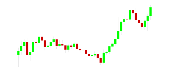
Figure 1 – A standard red and green candlestick chart
Colour of the candlestick
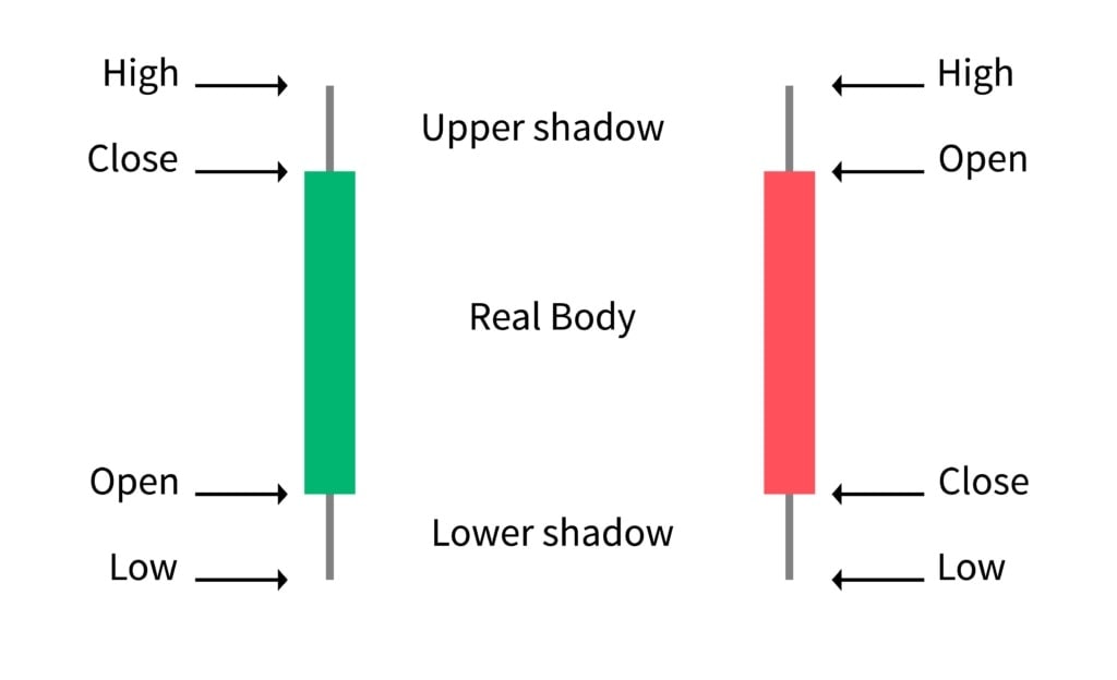
The body of each candlestick will most often be coloured in green or red. Green means that the overall price movement during that period was positive. Red means that the price movement was negative.
Interesting fact
The traditional Japanese candlestick charts used white for positive movement and black for negative movement. Some traders still choose to use this traditional colour scheme in their charts; others use different colours altogether.
Time interval
Each candlestick represents a period of time (or a trading period). The default setting for candles is usually one day, but there are lots of different time intervals that you can use. Lower timeframe intervals, such as the one-minute, five-minute, or 15-minute charts can be very effective for day trading. By contrast, higher intervals, such as the one day, one week, or one-month charts are more useful for long-term trading strategies. Some traders use a combination of different timeframes to get the best from both worlds.
Key takeaway
Low time intervals like five-minute or 15-minute provide a lot of details for day traders, whereas high time intervals like one day or one week are more reliable for long-term trades.
Open and close
The body of a candlestick will give you information about the opening and closing prices of an asset for that specific time interval (see Figure 2). With a green candle, the lower edge of the body indicates what price the asset opened at and the upper edge represents the closing price. Conversely, with a red candle, the upper edge represents the opening price and the lower edge indicates the closing.
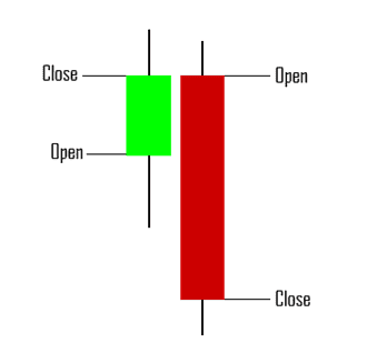
Figure 2 - Candlestick opening and closing price
A chart consists of multiple candlesticks in a row. You might have noticed that the open of the red candle lines up perfectly with the close of the body of the previous green candle.
High and low
The wick of the candlestick shows the highest and lowest prices of an asset traded at during a specific time interval (see Figure 3). The top of the wick represents the highest price the asset traded at. The bottom of the wick signifies the lowest price during that interval.
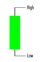
Figure 3 – Candlestick high and low
High and low
The wick of the candlestick shows the highest and lowest prices of an asset traded at during a specific time interval (see Figure 3). The top of the wick represents the highest price the asset traded at. The bottom of the wick signifies the lowest price during that interval.
High and low
The wick of the candlestick shows the highest and lowest prices of an asset traded at during a specific time interval (see Figure 3). The top of the wick represents the highest price the asset traded at. The bottom of the wick signifies the lowest price during that interval.
Interpreting candlestick patterns
There is a range of different patterns that traders use to determine trends in the market. This piece will cover two important bullish chart patterns and two essential bearish candle patterns. Most traders use chart patterns along with other indicators to predict market trends. It’s worth noting that most chart patterns are more effective using a higher time interval, such as a one-day or one-week chart.
Important to remember
Charts are only one tool in the trader’s toolbox and are often used alongside a variety of indicators, such as RSI or MACD, to more accurately predict price direction in the market.
Bullish patterns
Bullish patterns are candlestick patterns that have historically resulted in upwards movement once completed.
Bull pennant
A bull pennant is a type of continuation pattern that forms when there is a large movement upwards, followed by a period of consolidation with converging trend lines (Figure 4). If the pattern is confirmed, there is a high chance of continued upwards movement.
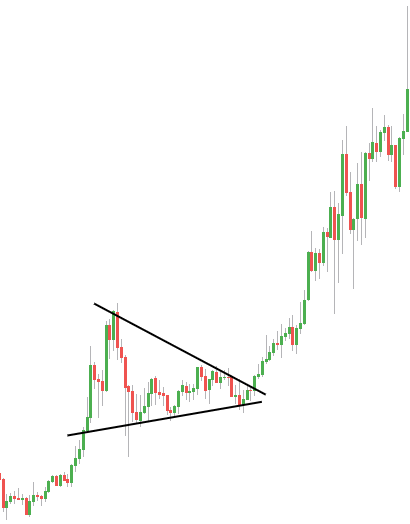
Figure 4 – Bull pennant pattern
Falling Wedge
A falling wedge is a type of reversal candlestick pattern that is characterized by downward converging trendlines (see Figure 5). The trend lines, which are drawn above the highs and below the lows, begin to converge as the downwards movement loses momentum and buyers re-enter the market to slow the rate of decline. There is often a price breakout above the upper trendline before the lines converge.
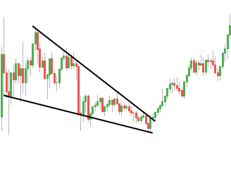
Figure 5- Falling wedge pattern
Bearish Patterns
Bearish patterns are candlestick patterns that have previously resulted in downwards movement after they have finished forming.
Head and shoulders
A head and shoulders is a reversal pattern that presents as a baseline (also known as the neckline) along with three peaks, the outside peaks (known as the shoulders) are close in height and the middle peak (the head) is the highest (see Figure 6). It is commonly used to predict an upcoming price reversal. It is important to note that the pattern is only complete if there is a close beneath the baseline. The head and shoulders pattern is considered to be one of the most reliable reversal patterns.
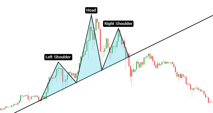
Figure 6 – Head and shoulders pattern
Rising wedge
A rising wedge is a type of reversal pattern that is distinguished by upward converging trendlines (see Figure 7). The trend lines, which are drawn above the highs and below the lows, begin to converge as the upwards movement loses momentum and sellers step in to slow the rate of growth. Often, there is a price breakout below the lower trendline before the lines converge.
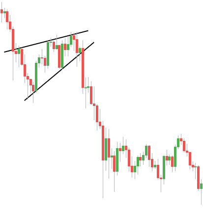
Figure 7 – Rising wedge pattern
How to draw a candlestick chart
TradingView is a great platform for drawing charts that features several useful tools. In particular, the trend line tool and the horizontal ray tool are commonly used by traders and investors. The Trend Line tool is used for connecting candlesticks to create the patterns like those mentioned above. The Horizontal Ray tool is helpful for marking support levels, resistance levels, and for highlighting your buy and sell targets.
It is important not to become emotionally attached to a coin, because this may influence the patterns that you draw, and you may in fact identify patterns that are not supported by any real evidence. That’s when you can find yourself in a lot of trouble. Therefore, we must always try to draw charts based on the available evidence and never based on emotion, sentimentality, rumour, or what you think the coin is worth.
Summary
Learning how to read a candlestick chart is one of the essential skills of every successful trader. This article has covered what a candlestick chart is, how to understand them, and how to recognise some basic patterns and what they mean. This information is the foundation of technical analysis, which you can read more about on the Swyftx Learn platform. Knowing how to read crypto charts, along with key indicators, is sure to serve you well in your trading and investments.